Perfect Imperfections Poster Inspiration

For my poster I wanted it to represent what the animation was about, people’s stories told from their memories. So the brain was my first idea.
Screen Shot 2015-05-10 at 20.05.29

When I saw this photograph I immediately thought about half of a character’s face and then assets from the story making up the other half and some more flying off. I wasn’t sure if I would have enough assets for an image like below.

Screen Shot 2015-05-10 at 20.07.16So I thought about Perfect Imperfections and how people accept their imperfections. it reminded me of this Banksy image. I could start off the face with assets from the animation but then as it flies out it starts to turn into more happy icons like smiley faces, love hearts and butterflies. I like the idea of this poster as it shows that something that someone would think is ugly is actually beautiful.120124-1Screen Shot 2015-05-10 at 20.07.4311101149_995772427100307_1281999009_nScreen Shot 2015-05-16 at 00.32.12Screen Shot 2015-05-10 at 20.08.31 Screen Shot 2015-05-10 at 20.09.58

Intro to Animation

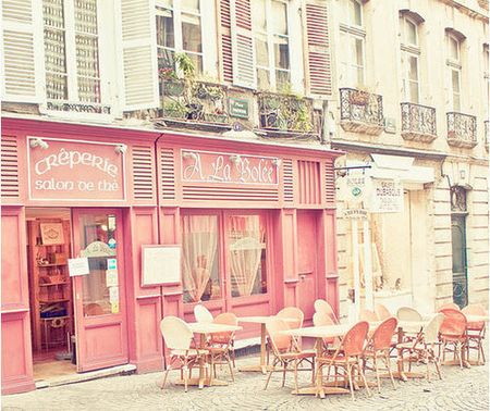
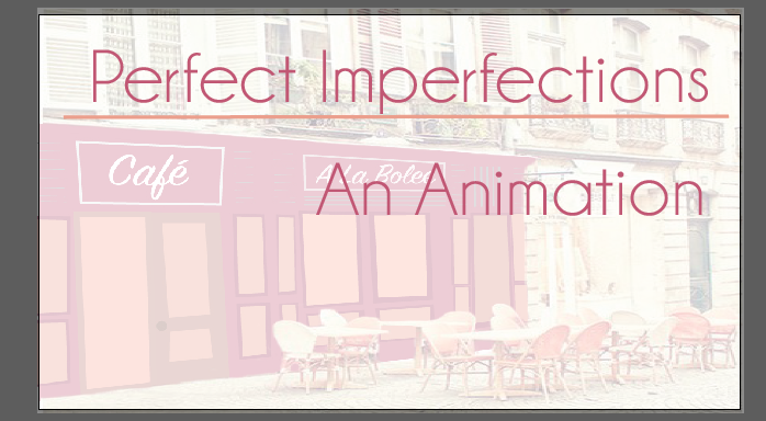
I wanted the opening video to set the scene for the animation which is in a coffee shop. I googled photographs until I found that suited my vision. The color scheme of this stood out to me.
cafe1 
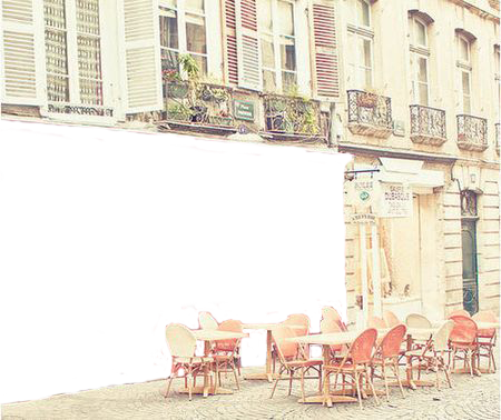
In Photoshop I erased the cafe because I wanted to draw the cafe but I also wanted to use the chairs in the front so this was the best option for that.

cafe1

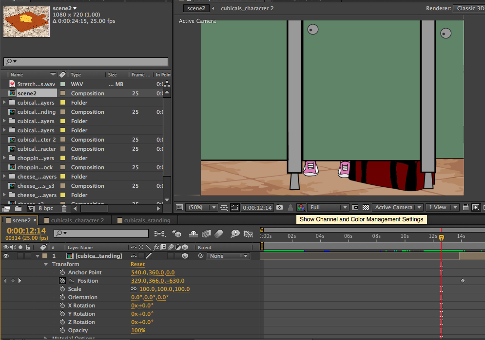
I then drew over the Cafe to suit the style of the rest of the animation. I used movements in After Effects to pan the camera.cafe_plain
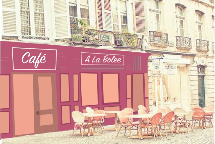
I wanted to add in the name of the project and it’s tagline. I wanted to use white text over it. So I researched some designs.

I used Illustrator to create the text box. Screen Shot 2015-05-16 at 11.26.52 Screen Shot 2015-05-16 at 11.28.50
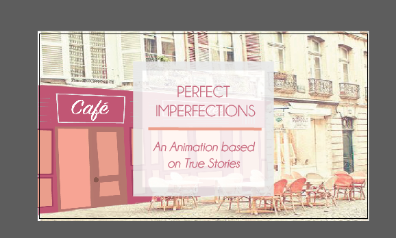
I went with this one (below) as it looked the best. Also based on feedback they said it looked more professional and feminine.

To bring this text box I dropped it into Final Cut Pro and used the video animation to fade it in and out.Screen Shot 2015-05-16 at 11.37.29

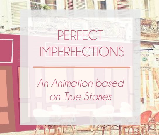
(Below was created as part of the Post Production Module for our Enhancing Video assignment.)

To create the intro I recorded four people sitting around a table like the picture below.

Screen Shot 2015-05-10 at 20.42.56
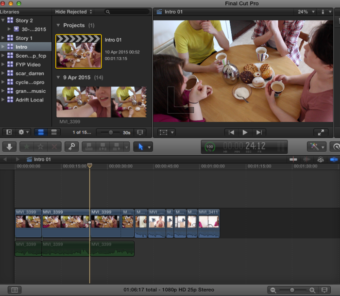
In the video they drink tea and move their hands. I wanted to draw over them so the table would still be life like but the character would be animations. After playing around with the bone tool it should wasn’t working well enough so I decided to keep it simple. After importing the footage and edited it down to the sections I wanted.

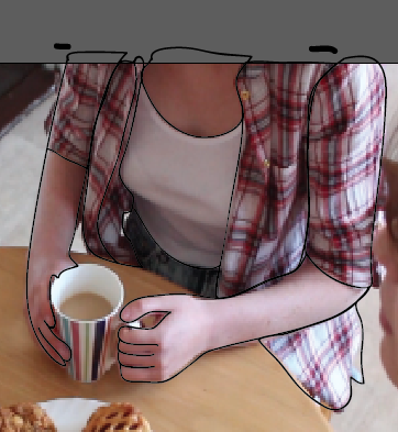
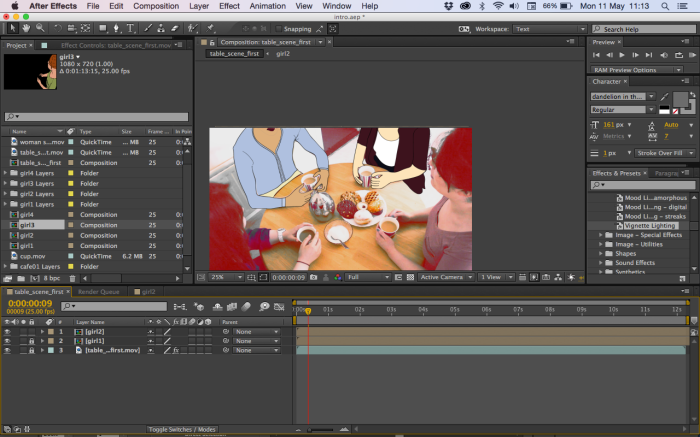
Here you can see the characters drawn the original footage.

Screen Shot 2015-05-11 at 01.28.50When they were all filled in I brought them into after effects where I used color correction to edit the background. I wanted it to look a bit cartoonish while still being seen as a real life table and cups.

Screen Shot 2015-05-11 at 11.03.45Screen Shot 2015-05-11 at 11.13.44

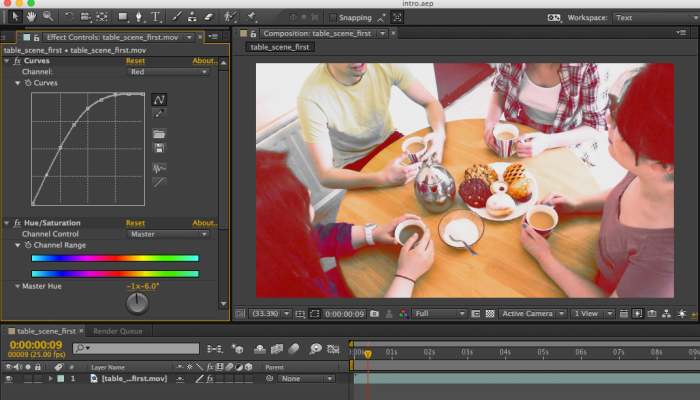
I am really happy with the way it turned out and compliments the style of the animation.

To add some effects I used the particle playground effect to give the kettle some stem. I used the fast blur effect to make it look more like stem and not particles. I am happy with the way it came out. When I exported it and brought it into Final Cut Pro the stem was rises too fast so I cut the clipand slowed down the section I wanted.
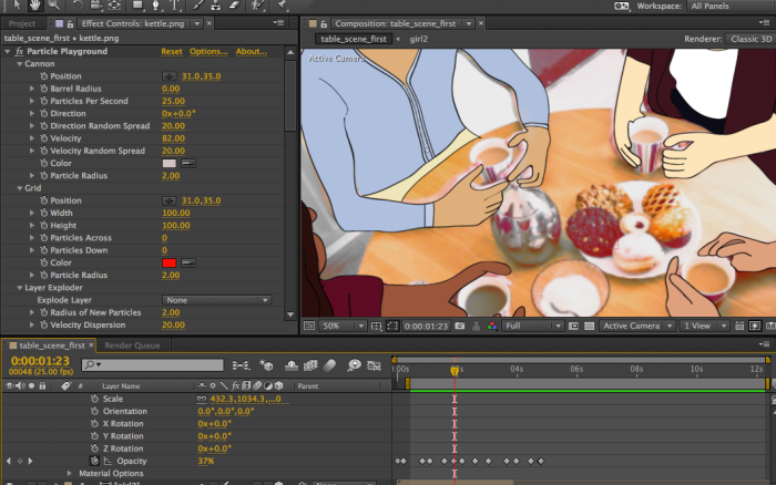
Screen Shot 2015-05-11 at 14.52.00


Putting Animation Together

Based on feedback from my supervisor I decided to put the first part of the animation together first which would be the beginning of each story when the women share what happened to them. I did this so I would know if it worked as one animation. If it did not I would have my project as 4 separate videos. Here is the rough cut:

link: https://vimeo.com/127985851

I was very happy with how it turned out and showed it to fellow classmates and they agreed it worked. The vision was going ahead.

I started by looking at my word doc that had all the scenes split up in writing. I had each story color coded too so it as easy to find. I then went through my animated stories and cut and chopped where needed be. I then placed them all in the correct order in Final Cut Pro.

Screen Shot 2015-05-16 at 16.43.29

I went through it many times to make sure the transitions flowed together.

Screen Shot 2015-05-16 at 12.10.32

I then touched up any audio that sounded off. When I put them all side by side I made sure they were all the same levels, as were the sound effects and background noises. Screen Shot 2015-05-16 at 16.39.44When I showed the finished piece to my fellow classmates some feedback I got was that by the time they got to the 2nd scene of the 4th story (Brain Injury) they had forgotten what happened her. So I proposed to to a flashback before the scene started. The flash and flashback effect was looking too gaudy for me so I went with a fade to color before the snippet where the rock hits her head, then the 2nd scene follows where she talks about having surgery. After showing this to classmates again they approved.
Screen Shot 2015-05-16 at 16.41.56
The end scene is where each woman says their inspirational part at the end. I decided to finish up with some kinetic typography over the table scene. It was originally looking to messy so I grabbed this pink sheer square from the intro scene and placed the text on that.
Screen Shot 2015-05-16 at 16.06.10

I made the text in After Effects and exported it with a RGB and Alpha setting so it would be transparent when I brought it into Final Cut Pro.Screen Shot 2015-05-16 at 16.45.18

Story 4 – Brain Injury

Link: https://vimeo.com/127980377

I started to animate this story when I completed the graphics. The first is a photograph of a mountain, I put an effect on it. I then created clouds and in After Effects I keyframed them to move in the sky.
Screen Shot 2015-05-16 at 00.07.42

This photograph has an effect on it. The rock is keyframed to fall down and hit the back of her head. As it hits her head her head moves to the right and drops down.
Screen Shot 2015-05-16 at 00.07.57 I used the effect Page turn to turn the pages of this calendar. I dropped the opacity to 0% as it falls off so your eyes are on the next date on the calendar. Screen Shot 2015-05-16 at 00.08.25I created a mother, father and doctor character here. I applied a mask over the scene so it looks like her eyes are opening to see her family. I am really happy with how this turned out.
Screen Shot 2015-05-16 at 00.09.00 Here I used kinetic typography to show that she relearned how to walk and talk.Screen Shot 2015-05-16 at 00.09.24 I dropped the opacity to let the grim reaper fade in and out here as she thinks about her close call with death. Screen Shot 2015-05-16 at 00.10.38 Here you can see the who asks her “What’s that on your neck?”. I also used the bone tool to move his arm up and point his finger. Screen Shot 2015-05-16 at 00.11.01 The character is wearing her climbing gear, including a helmet. The background is the same as before, I just added in more clouds as this scene is longer than the other. The USB stick in her pocket gets lightings stripes as she talks about it to highlight its power to her health. Screen Shot 2015-05-16 at 00.33.41The sounds were downloaded and brought into Final Cut pro to put into the animation. 
Screen Shot 2015-05-16 at 00.13.04

I showed the rough cut version to my supervisor Daniel he gave me some feedback to make it better such as changing the hospital background as they first one was too obvious that it was an effect. I also added in a scar to her neck and made the grim reaper longer.

Website – www.perfectimperfections.co

From doing some interface research I knew I wanted a very plain site, basically just a place to hold my animation. I did not want to just upload it to Vimeo and link people to it from there, it is more professional to have a site.
After looking and testing out many different themes I choose the invictus theme.  It had the option of autoplay video background which is what I wanted and it is also responsive. I then started editing the theme,  deleted some code from the header.php that i did not need any more – logo and the nav bar. I then downloaded a plugin called wp splash page that i used to make my splash page with the introduction video. I tried to edit it so that after the splash page the next page comes up but you have to press the next button.11256329_10205789250864215_1165282528_o11241293_10205789250464205_226263500_o11232416_10205789250704211_116790956_o
When I tried to upload my videos to my wordpress gallery it would not allow me as they were too big, the max they allow is 16mb which is nothing in relation to video. So I embedded my Vimeo videos. They however were not HD so I am using Youtube to embed the animation. Atleast I know it will load quickly and be in HD.

Story 3 – Stretch Marks

Link to video: https://vimeo.com/127778966

I started off with scene 1 with the opening of the schools door. I first applied a mask on either door and the surrounding building. The mask would not allow the doors to move inwards just swipe to the side or up so I used keyframes to make the doors open. Screen Shot 2015-05-14 at 00.46.17I then went ahead with the locker scene. My illustrator file appeared very blurry(below) so I edited it and it was still very blurry. The image quiality of the origianl image was too poor so I reverted back to my previous graphic of the locker scene. Screen Shot 2015-05-13 at 14.02.42Screen Shot 2015-05-13 at 14.02.35I used real flooring and walls to tie it in with the rest of the story’s style. I placed this underneath the door layers and keyframed it to move and change in size as the doors opened.Screen Shot 2015-05-13 at 14.32.10For the school scene, I firstly added in some background images that my sister took of her classroom. I think it adds realness to the scene. I created the spinning globe in blender. It was nice to use another program apart from After Effects and Illustrator. I dug out my 3D modellling and animation notes to help me along.Screen Shot 2015-05-13 at 13.16.36I then brought the rendered animation into After Effects and put a circle mask on top. From here I matched it up to the globe holder. The lighting in the background image matches up to the light in the globe.

Screen Shot 2015-05-14 at 01.01.26For the school uniform in the bin scene I just applied the bone tool to the tie to make it flow in the wind as if it was hanging of the side of the bin. Screen Shot 2015-05-14 at 00.51.08I used pen strokes and the trim paths effect to create the cracked mirror. I really like the way this turned out. Screen Shot 2015-05-14 at 00.50.40Screen Shot 2015-05-14 at 00.50.53

I used keyframes to get the clothes moving. I played with some sound effects to make it sound like people changing, I am happy with how it turned out. Screen Shot 2015-05-14 at 00.49.01The Bebo message scene was done using kinetic typography and the typewriter effect.
Screen Shot 2015-05-14 at 00.50.11Screen Shot 2015-05-14 at 00.50.01The cubical scene starts off with us seeing feet behind the door and a bag beside the feet. We are then shown the character.
Screen Shot 2015-05-14 at 00.49.10

I used numerous sound effects for this animation. I downloaded most of them from www.freesfx.co.uk/ , which is where I get most of my effects for the animations.

Supervisor Meeting 8/5/15

At the meeting today I got some feedback on my designs for the 3rd story.

The following images are graphics for scenes in the 3rd story. Some feedback I got:

They are a different style to my other stories. There is a lot of drawn elements and not enough photograph elements like my last animations. I can add photographs for the walls and floors. I will also play around the the locker scene at the beginning so it looks more realistic.

Screen Shot 2015-05-09 at 13.05.21 Screen Shot 2015-05-09 at 13.05.27 Screen Shot 2015-05-09 at 13.05.33 Screen Shot 2015-05-09 at 13.06.47 Screen Shot 2015-05-09 at 13.06.53 Screen Shot 2015-05-09 at 13.07.00

Setting up website domain

For my website I wanted the domain http://www.perfectimperfections.com , unforunatly this was already registered. My options were limited.
Screen Shot 2015-05-06 at 16.14.02

.ie comes with complications so my best bet was with http://www.perfectimperfections.co . I researched .co and learned it is a universal url. The .co domain is also used by many established brands for social and mobile media, such as Twitter (t.co), Google Inc. (g.co), Amazon.com (a.co), American Express (amex.co) andStarbucks (sbux.co).
Screen Shot 2015-05-06 at 16.16.20 From Blacknight I got the domain and downloaded WordPress.Screen Shot 2015-05-06 at 19.39.30 Screen Shot 2015-05-06 at 19.41.54

Website Template Ideas

I started looking at some templates for my website. I want the site to be very simple, I want it to hold the animation in full screen with a play button. I have researched some templates that hold videos in the home page. My site will basically be one page. When you go onto the site the background is a video(full screen) with moving graphics, over that to the left there will be a short description of the project (splash page). The user will then press play when it is all loaded. The animation will then play.

Some templates that I am taking inspiration from are:

http://www.eneaa.com/templates/zeus/Screen Shot 2015-05-06 at 20.15.40

http://easysite.by/teardrop/home-video-bg/

Screen Shot 2015-05-06 at 20.18.35

http://www.renklibeyaz.com/thisway/?preview=20

Screen Shot 2015-05-06 at 20.19.34

http://themify.me/themes/music

Screen Shot 2015-05-06 at 20.20.46

http://themeforest.net/item/invictus-a-fullscreen-photography-wordpress-theme/180096

Screen Shot 2015-05-06 at 20.34.15

Story 2 – Version 2

Link : https://vimeo.com/126766636

Based on feedback I made the following changes

Added more furniture to the room and fixed her back and neck

Screen Shot 2015-05-05 at 13.55.13

Added lip movement and extra spots. Screen Shot 2015-05-05 at 13.55.43

Pizza face is more obviousScreen Shot 2015-05-05 at 13.56.09 After playing around with different effects on the cape I gave up on it and added in a new background. The background is like a wallpaper of make up. It suits the scene because that is what she is talking about.Screen Shot 2015-05-05 at 13.57.22

I placed the mask on top of the vanity stand.
Screen Shot 2015-05-05 at 13.58.21 Screen Shot 2015-05-05 at 13.58.36